Project Overview:
In this project, I undertook a comprehensive analysis of customer churn within a fictional telecom provider called Databel. The primary objective was to understand the underlying reasons for customer attrition, commonly referred to as churn.
Churn is the rate at which customers leave a company, highlighting the importance of retaining existing customers over acquiring new ones for sustained revenue growth.
Churn calculation:
Churn calculation involves measuring the rate at which customers cease their association with a company within a set period compared to the total customer count, with variations in calculation methods based on industry-specific criteria.
Strategies for Churn Reduction :
My mission involves identifying the underlying causes of churn within Databel and devising strategies to mitigate this issue using my data analysis skills and Power BI expertise. Through thorough analysis of Databel’s datasets, I aim to pinpoint areas contributing to churn and present actionable insights through graphical representations, enabling stakeholders to take targeted measures to retain customers.
First dashboard: Main insights
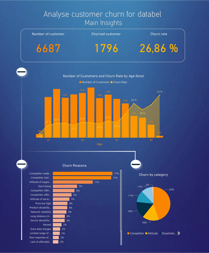
Key Performance Indicators (KPIs): At the top of the dashboard, three KPIs are presented: the total number of customers, the number of customers who have churned, and the churn rate. These indicators provide an overview of the company’s performance in terms of customer loyalty.
Customer Age Distribution: A bar chart illustrates the distribution of customers by age, with the churn rate overlaid as a line. This visualization helps identify age groups most likely to leave the company, providing valuable insights for targeting retention efforts.
Breakdown of Churn Reasons: In the bottom left corner, a bar chart breaks down the reasons for churn, highlighting the percentage of customers leaving for each reason. This detailed analysis identifies the primary reasons for customer departure, thereby guiding retention actions strategically.
Churn Categories: Finally, a pie chart presents churn categories, highlighting the main reasons for customer departure, particularly those related to competition. This visualization helps understand the underlying factors driving churn and prioritize actions to counter these trends.
Second dashboard: Groups and Contracts
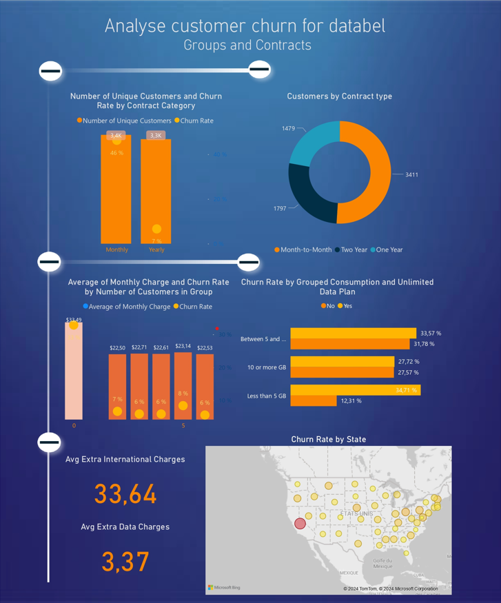
Groups and Contracts: These graphs visualize the distribution of customers based on their contract choices (monthly or yearly) and help understand how this impacts the churn rate. This gives a clear overview of customer preferences in terms of contract duration and their propensity for long-term loyalty.
Distribution of Customer Groups: Visualizing customer groups helps segment the customer base based on the number of individuals in a contract (single or grouped) and their average monthly charge. This helps identify the most profitable groups and understand how the average cost affects their likelihood of remaining customers.
Unlimited Data Plans: This visualization helps understand customer behavior regarding unlimited data plans, highlighting data consumption preferences and their impact on the churn rate. This can provide insights on how to adjust data offerings to better meet customer needs.
Additional Costs and Churn by State: Finally, analyzing additional costs and churn rates by state helps understand regional variations in customer behavior and the factors influencing their likelihood to churn. This can help target retention efforts in regions most sensitive to churn and adjust offerings accordingly.
Third Dashboard:Account lenght & Payment Method
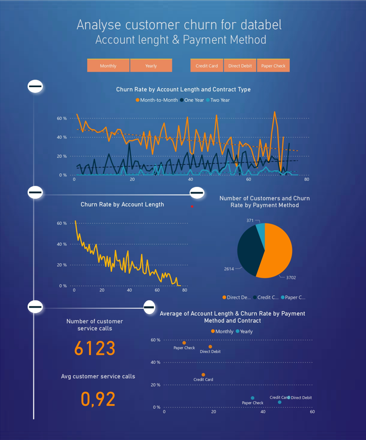
Filters for Contract Types and Payment Methods: The filters allow users to select contract types (monthly or yearly) and payment methods (credit card, direct debit, or paper check) for customized data analysis.
Churn Rate by Account Length: This graph shows the churn rate based on the duration the customer has held the contract. It helps understand how the subscription duration influences customer loyalty.
Churn Rate by Account Age: This visualization presents the churn rate based on the age of the customer’s account, offering insights into the relationship between membership duration and the likelihood of churn.
Number of Customers and Churn Rate by Payment Method: The pie chart displays the number of customers and churn rate for each payment method, helping understand which payment methods are associated with a higher churn rate.
Customer Service Calls: The two KPIs on customer service calls provide information on customer interaction with the customer service, which may be linked to their satisfaction and likelihood of remaining customers.
Average Account Length and Churn Rate: Finally, the scatter plot shows the correlation between average account length, churn rate, and payment method. This helps identify trends and relationships between these key variables.