
All data shown on this page are fake data generated by an AI to maintain confidentiality.
Project Overview:
As a Data Analyst at Intys, I developed financial dashboards for the CFO, incorporating data such as consultant names, Business Units, contract statuses, salaries, and absences. The project aimed to analyze overall company performance, BU-specific metrics, and monthly budget vs actual comparisons. These dashboards were designed to offer clear strategic insights, enabling the CFO to make informed decisions to optimize the company’s financial operations.
Exploratory Data Analysis:
To accomplish my project, I first had to perform data cleaning on the initial dataset I received. Using advanced Excel functions, I created a consolidated Excel table to facilitate the creation of pivot tables.
Visualization and Dashboard Creation:
I had to create dashboards according to the various KPIs required by the CFO, taking into account her expectations and goals in terms of dashboard presentation and informatio
Principal dashboard
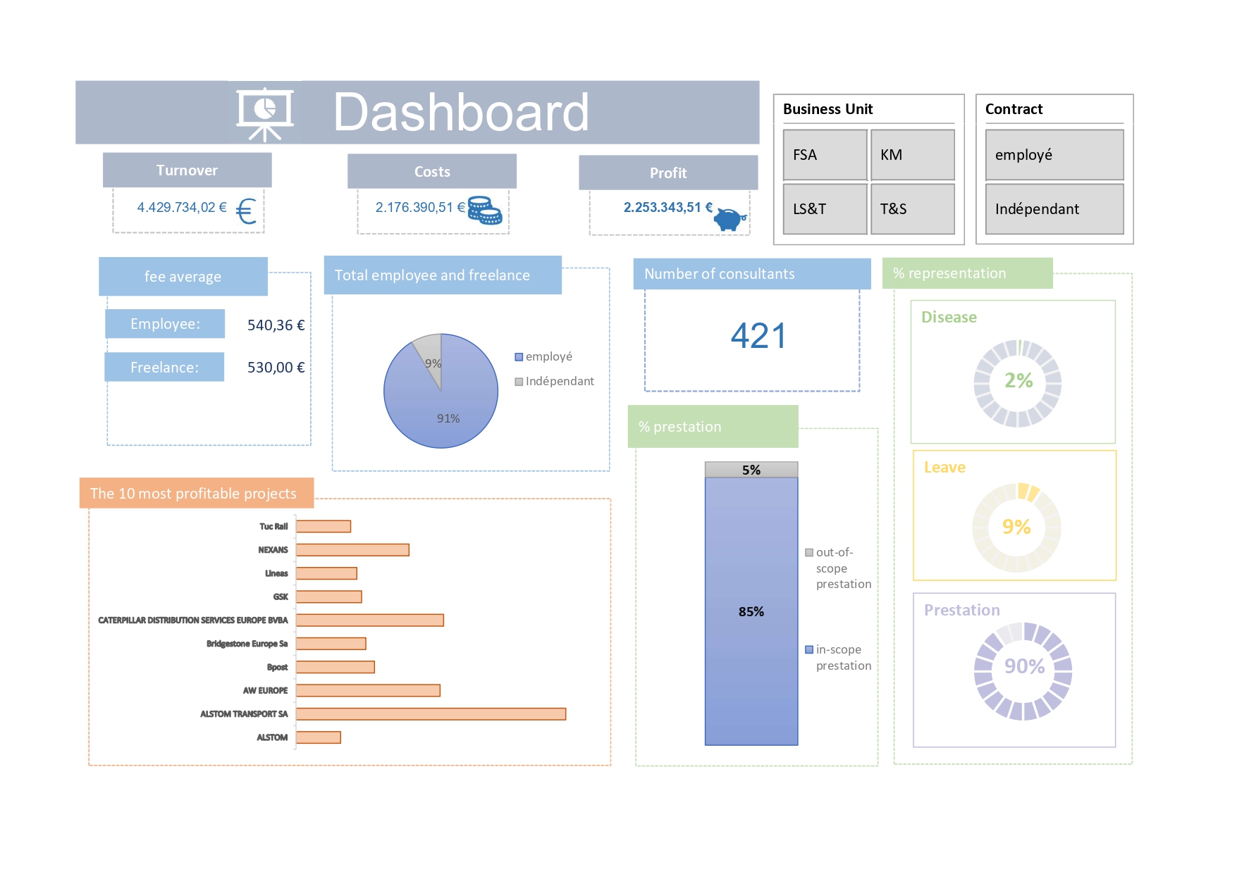
Explaination: The choice of graphics in this dashboard aims to provide a clear and quick view of the data. Raw KPIs offer an overview, while pie and bar charts allow for visual comparison of data. Filters provide analysis flexibility, while performance rate and percentage graphics offer key insights into employee performance and HR management. In summary, this dashboard is designed for efficient analysis of company performance from various perspectives.
Dashboard by BU:

Explaination: This dashboard is designed for comparing performance across different Business Units (BUs). Filters allow selection of specific data by BU and contract status. Bar charts represent turnover, costs, and profits per BU, facilitating performance evaluation. Additional graphs show days off, sick leave, and out-of-scope work days, as well as project participation percentage, providing detailed comparative analysis of HR management practices.
Budget Dashboard:
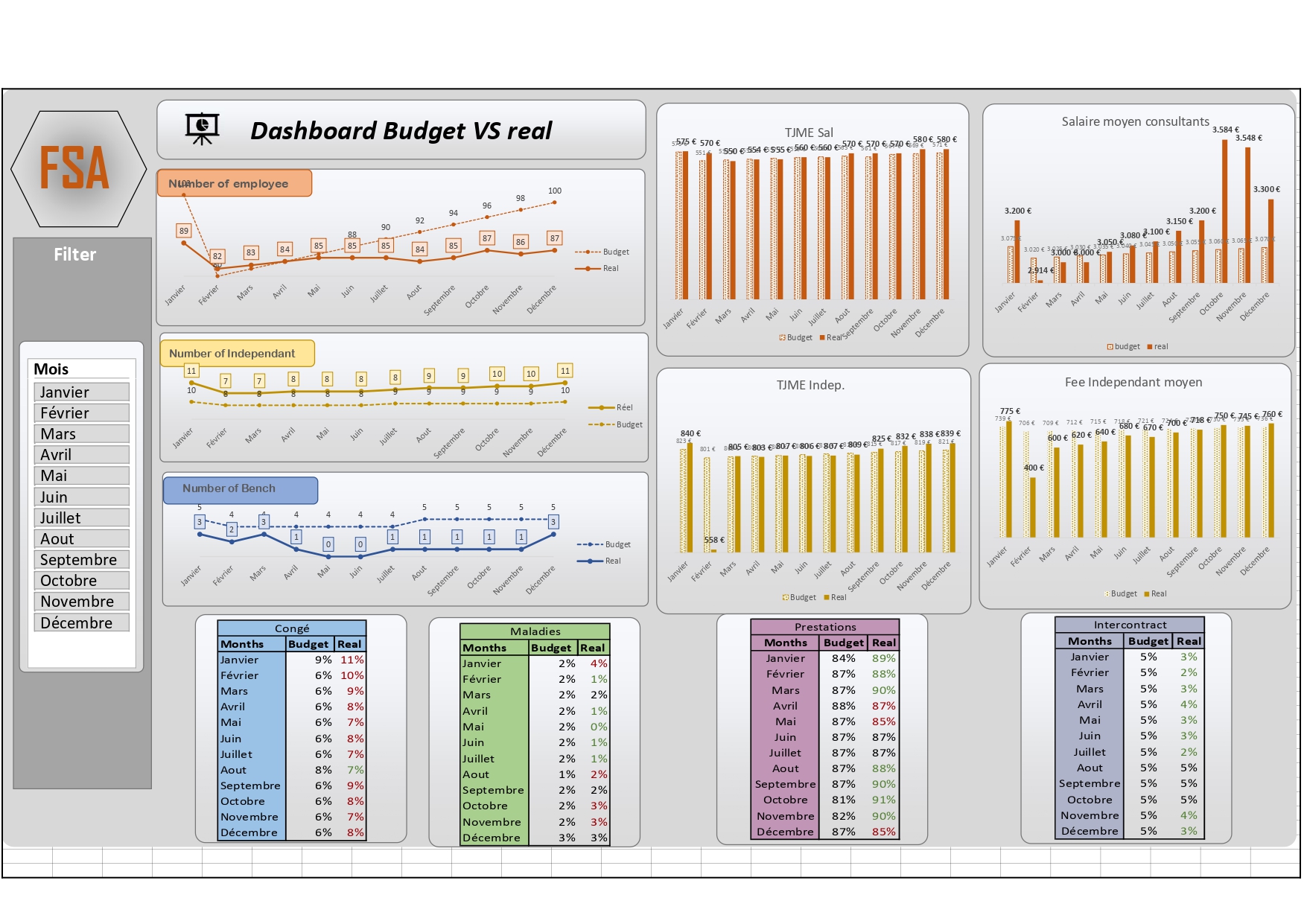
Explaination:
The line graphs provide a dynamic view of monthly trends in budgets versus actuals, enabling quick analysis of discrepancies. Monthly filters facilitate detailed data exploration. Bar graphs for TJME and daily costs offer a visual comparison of financial performance across different types of workers. Detailed tables comparing budget to actual figures provide in-depth analysis of variances, with color highlighting significant deviations. This layout optimizes readability and clarity of information, offering a rapid and precise understanding of the company’s financial and operational performance.